Monday 26 December 2011

Inspiration for an industrial bedroom

I am now working on getting inspiration for my next makeover project. Last week I had featured a photo of the room, click here (it's the last photo in the post). The owner of the room will remain anonymous, as long as you do not guess who it is. :-)

This room will be a different challenge, as the owner is a guy and I've never really read articles on decorating for guys' bedrooms.

The look that came to my mind was industrial.

Smelter rooms
Okay, minus the broken glass on the floor and the graffiti (though it doesn't look so bad here, does it?). Throw in a bed, some pillows and a wardrobe and it would look great.

I bounced the idea off the owner, and he seemed genuinely excited with it. As he is quite the movie buff, I tried to give him a picture of my idea of the industrial look - the "dilapidated" warehouse in Inception.

Yusuf sharing an idea with the team. Yeah, I love this movie.
I love the chalky blue-greys, the cement floor, the peeling paint on the brick walls, the worn wooden tables, the black steel filing cabinets. We even joked about having newspaper sellotaped to the windows for curtains, and I noticed that's exactly the look they had here!

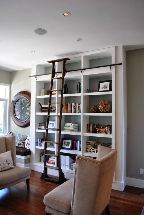
I did some blog-surfing and came across Roman and Williams work, where they totally nailed the industrial look in the residential.


The picture above is one of my favourites. I love the dark aged wood and the organised chaos of this room.


Another view of the same room. Love it.


I also look for inspiration when I'm watching TV (which I don't really have much time for). When I'm watching a show, I'm usually checking out the room decoration more than I am concentrating on the storyline. I wonder if anyone out there is like that too.

So last Saturday, my sister was watching New Girl where I noticed the room was stylishly industrial.

Last Saturday's episode. Don't ask me what it was about.
While Jess is playing with bells here, I'm noting the mismatched dining chairs, the wooden top table and  iron legs, the rug, the exposed brick wall and the stainless steel kitchen island. Nice!

I believe this is the first episode, because Damon Wayans Jr. is in this screen shot.
I have been trying to look for ideas on how to do curtains in the room. I thought sheer curtains might look too feminine, but the ones in the picture above proved me wrong.

I also look for inspiration when I'm walking past shops in shopping malls. I saw these chairs in the photo below in two restaurants so far, and have been wondering where I can find them. They look so industrially cool.

countryliving.com
I have my mind set on looking for an industrial lamp for the room, too. I'm sure I can find a nice, moderately priced one at Ikea like this one. Love the little details on it.

ikea.com.my
That's all for now. I think I now have an idea on how to decorate the room. Can't wait to get started!

Have a great week and a Happy New Year!


PS: Thanks to my husband for lending me his laptop for me to write this post. And sincere apologies to him for dropping it on the floor when our 1-year-old was trying to climb on my lap. :-(

Thursday 15 December 2011

We're done!

For those who have been following my blog, you would know that I had appointed myself as my sister's room decorator.

After many weeks of struggling to find spare weekends, the room is finally finished! To see the before pictures, click here.

Let me begin by saying that I had a great time decorating this room and my sister is a great "client" with great taste. The completed project is more of a collaboration of ideas and shopping trips between me and her.

Let's scroll down to the photos!

This is the actual view of the room when you enter from the door.


A lot of the items in the room are either bought from Ikea or revamped old furniture. The white bookshelf you see in the photo above was previously grey with black trim. I asked my sister to paint it white using the extra paint that was used to paint the door.

The blue is a Nippon paint called 'Shy Sky'. I'm glad it turned out the shade we wanted it to - a cool, blue-grey.

This is what you see when you enter the room.


The challenge we faced was finding a place for the huge desk with the computer and it's hideous wires. My sister spends a lot of her time on the computer (yes, you do, sis. Don't deny it), so the option of having it any where else but her bedroom was a no-no.

After making multiple rearrangements of the bed, desk and the bookshelf, we decided that this was the best layout.


The wicker in the room - the chair at the desk and the baskets on the bookshelf - help to add texture to the room which mainly consists of clean lines.


The blank space of wall above the bookshelf would look great if we had a mirror to hang. But that will need to wait for now as we have already exceeded the initial budget.

Finally, a new lamp! The butterflies in the pretty frame are actually confetti from the Coldplay concert my sister went to in Singapore.


The wardrobe - I wanted a simple neutral colour so that it would not overwhelm the room.


If you notice, the ceilings have been lowered. They are no longer slanted. The previous high ceilings resulted in poor air circulation - lowering them down helps to cool the room better. The main reason the makeover took so long was because we needed to replaster the ceilings for the whole second floor of my mother's house. Now the second floor is cool and comfortable!
 
Some small details on the desk.


I hope you enjoyed seeing the photos of the completed room! As for me, I'm happy that my sister is happy.

Now I'm looking for my next makeover project, and I've got my sight set on this room:


Have a wonderful day!

Sunday 27 November 2011

Book indulgence!

Before I begin, let me just say that I'm trying to update my blog with an 11-month-old squirming on my lap. So this update is going to be short and simple.

I've always been rather frugal in my spending, but when it comes to books on decorating, I am a sucker.

What's great about working in KLCC is that Kinokuniya is nearby, and you can find design books that you would not find anywhere else in the country.

Just in case you don't know where KLCC is. It's the best place to work. So they say. Source unknown.

Two weeks ago, I had been scouring the shelves of Kinokuniya for a book titled The Business of Design by Keith Granet, a book that was recommended by my favourite blogger, Brooke Giannetti,  in her blog Velvet & Linen. 

As I was searching, I literally gasped when my sight fell on Patina Style! The book that I had sought and thought would never reach our shores! The book written by Brooke Giannetti and her equally-talented husband, Steve Giannetti!

Note: People who know me well would know that it is not easy to get me excited over anything.

I grabbed the book over to the counter and asked them to open the plastic cover for me. They told me there was only one copy in the store, and I believe the only... one... copy... in the entire NATION. And it would take a few weeks to replenish if this one was sold out.


With no cash in hand, I walked out, and several days later, I made a beeline to the store again and bought not one, not two, but three different books.

My bedtime books.

Patina Style, The Business of Design and Design Sponge at Home. Okay, the third book was on a 30% discount with another purchase. And who knew when I would be buying a book again, right?

Design Sponge at Home is also a spin-off from the Design Sponge blog which is a hit, too.

I literally devoured Patina Style in just one night. It is truly a feast for the eyes. As they say, a picture speaks a thousand words. I love the cover.

Finished in one night!

I am not sure if non-readers of the Velvet & Linen blog would enjoy it as much, but it makes a great coffee-table book with generously large, beautiful pictures and simple text. There are a few tips here and there for those who would like to emulate their design aesthetic of decorating with aged and antique pieces.


One of my favourite pictures in the book.
The authors also talk about decorating your bathroom as you would any other room in the house. Like this one for example. You would never know it was a bathroom from this shot.

What I also love about it is that they celebrate the beauty of imperfections - linens that look better over time, unfinished wood revealing a facade of its history. It's a wonderful liberation from being fussy over scratches and dents and faded fabrics.

So now I'm a quarter through The Business of Design. And I've not started Design Sponge at Home yet. I'll tell you if they're good with a review in my future post. Promise!

Salam Maal Hijrah and happy holidays!

Sunday 13 November 2011

Dining with books

Having a young child at home affects your decorating style. My husband and I had to forgo the idea of having a coffee table - our little one needs the space to crawl on our carpet. Our end table decoration is nothing more than 2 wedding favours and a lamp pushed to the furthest corner of the table so that the baby can't get his curious fingers on it.

Recently I kept my books and magazines on one of the end table, but if you take a look at this photo below, you'll see the reason why I have had to move my stuff to a new location - the dining table.

What is it with children that they like to play anything other than their own toys?

I've seen photos of books stacked prettily on dining tables, thus this inspired me to do the same. Below are photos of lovely examples.

Source unknown
I love the chipped painted table and how the decoration is laid out in the photo above. The table adds a bit of rustic to the room that has a modern edge.

Source House Beautiful
My focus is on the black dining table stacked with books. Love the globe taking centre stage. Charming.

Source is also House Beautiful
Bright coloured flowers among the darker hues of the books stacked around it.

Source unknown
The table is full of neatly stacked books and lovely vases and knick-knacks.

Source HGTV
So simple, yet so pretty. Books of the same size and colours are stacked in twos and threes.

Source unknown
Books, candle, flowers and fruit. The basics of lovely decorating.

So here are some of my books and magazines moved to their new location - the dining table! 


Have a wonderful week ahead!

Sunday 23 October 2011

Monday Blues

Feeling the Monday blues already?


One thing I know for sure is that blue is a beautiful colour and makes for great rooms. How the colour blue is associated with something negative is a mystery to me.


For those who love blue, this is for you!


Enjoy!

Let's first indulge in this room below. Just looking at it already makes you feel at peace. The black upholstered chair is a nice touch to the muted hues of this room.
Source decorpad.com

The light blue pillows makes a great accent colour in this beige and brown room.
Source yourdecoratinghotline.com

I love the white panelled walls and the light blue bathroom walls. Blue and white makes a fresh combination.
The natural wood floors are gorgeous too.
Source livebreathedecor.com


Blue as accent colours in this room is clean and pretty. I'm not sure about the polka dot pillow there.
Also from livebreathedecor.com
A pretty and cosy bedroom! The fact that the sheets are a little bit rumpled and not too neat makes this room feel lived in. I love rooms that make you feel at home.
Source unknown

I love the colour combination of white, grey-blue and brown. Chanel bedtime story, anyone?
Source ruemag.com

I like these blue sheets! This room is a little masculine, but I think the white throw on the bed balances it out. An androgynous room, perhaps?
And the industrial side lamp is gorgeous. My sister and I argued about the colour. I said it was silver. She said it was gold. It's brass.
Source westelm.com

Have a great week ahead!

Check out what this kid was up to when his mum and dad weren't looking.


Wardrobe, check!

Remember this wardrobe from this post of my sister's room?


Well here it is now!


As you can see, the painting of the walls are done too. I'm glad we got the blue right and my sister is happy with it too.

Can't wait till this room is finished!

Saturday 15 October 2011

Childrens Story Posters

Take a look at how these posters bring a new, rather dark perspective to the stories we grew up with.


 I always did feel these 'fairy tales' had a grim undertone to how the stories were played out. Well, didn't the word 'grim' originate from Brothers Grimm, anyway?

For more, visit the Square Inch Design Blog where these posters are by graphic designer Christian Jackson.

I would love to see how Bawang Putih Bawang Merah would have turned out, though. :-)

Friday 14 October 2011

Dreams

Well, duh.


Came across this quote in Pinterest. I love the fact that it's just so true.

Yeah, I'm on Pinterest, too. Addictive stuff. Sigh.

Saturday 24 September 2011

My Houzz

I've recently discovered Houzz, a cool website where you can keep a virtual scrapbook of inspiring photos of rooms that you can grab and save from their collection. The photos are constantly updated by interior designers, homeowners and manufacturers. Check it out here.

The only downside of the site is that your Ideabook is limited to photos uploaded in their website. I can't seem to be able to keep photos I find outside the website - but please correct me if I'm wrong.

I've created a gadget in my blog so readers can view my Ideabook. After going through my Ideabook myself, only then did I realise what my preferences are. There are a lot of beautiful photos of rooms in their library, but I tend to gravitate towords rooms with fresh pops of colours, blues, greys, clean lines with a modern-contemporary vibe.

Below are some of the photos of the rooms I've collected so far in my Ideabook if you were to click on it right now.

The below bedroom is so pretty and comfy-looking.  The throw on the bed give's the room it's warmth among the cool colours. Oh, I love the dark blue lamp reflected in the large mirror leaning casually against the wall.

contemporary bedroom design by san francisco Urrutia Design

Love the dark floors and the muted tones of this house. The painting on the wall adds some accent colour to the room.


Leslie Kalish contemporary bedroom
contemporary bedroom design

The gilded mirror against the rich colours of the wall is gorgeous.
huntley & co. | Spirited Refinement asian dining room
asian dining room design by dc metro interior designer huntley & co

I grabbed this photo below because the dining table and the chairs look rather similar to the one I have in my apartment. So this can be my inspiration of how I could decorate the dining room in our next home. 

Dining Room contemporary dining room
contemporary dining room design by minneapolis architect Charlie Simmons - Charlie & Co. Design

Don't you just love this room? Looks so sophisticated. I love the lighting and the pink accent colours. The funky blue armchairs also bring character to this otherwise neutral room.
Bergen Street Residence contemporary living room
contemporary living room design by new york architect Coburn Architecture and Interiors

 The photo below is inspiration of what can be done to the study room of a house.
Home Library contemporary living room
contemporary living room design by other metros kitchen and bath Tanner Vine - 2Go Custom Kitchens Inc

Let's move on to kitchen! I'm obsessed with this kitchen. I've probably downloaded all the pictures they've uploaded of it. The two tones just look so elegant and stylish.
Divine Kitchens LLC contemporary kitchen
contemporary kitchen design by boston kitchen and bath Divine Kitchens LLC

I was trying to figure out where the handles for the cabinet doors were. So when I saw this picture, I figured it's the push-open kind of door. The fact that they don't have handles makes the whole kitchen look so cool. The only problem is, you have to make sure your hands are clean each time you open them!

Divine Kitchens LLC contemporary kitchen
contemporary kitchen design by boston kitchen and bath Divine Kitchens LLC

See, I'm obsessed.  I even grabbed a picture of it's dustbin. It's actually the recycling bin. A bit small though. I guess the owner of this kitchen doesn't cook that much.


Divine Kitchens LLC contemporary kitchen
South Shore Residence contemporary bathroom
contemporary bathroom design by new york interior designer AMI Designs

There weren't many photos of pretty bathrooms, but this particular one caught my eye. It's very modern-contemporary, but with the weave baskets and white towels nestled prettily beneath the sink, it adds a lot of warmth and texture to its otherwise clinical feel. 


Check out the generous shower area. Nice, huh. Love the window. 
 
South Shore Residence contemporary bathroom
contemporary bathroom design by new york interior designer AMI Designs

This room caught my eye because of the parquet floor.


Brooklyn Row House eclectic living room
eclectic living room design by new york Office of Architecture

I always felt that parquet was a bit out of date, but it obviously works in this room. The warm-gold and matte finish keeps it up to date and stylish. 

So there you have it. Some of the photos in my Ideabook. I would definitely recommend you to create your own Ideabook if you can't seem to figure out what it is that you actually like. I'm looking forward to download more rooms in mine. 

Note of warning - Houzz is highly addictive.


Related Posts Plugin for WordPress, Blogger...